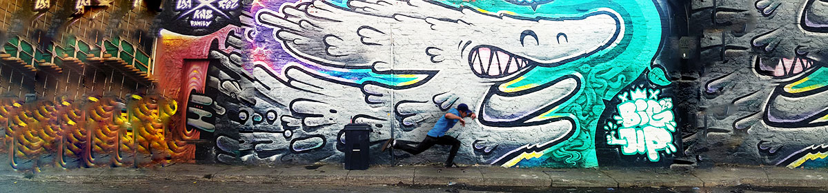

For my header I wanted my it’s image to capture the art of skateboarding as well as fashion. By providing a skateboarder pushing and riding on his board it easily captured the motion of a typical skater. I also added a colorful mural to express the freedom and joy skating brings to people. The reason I also added the mural was to satisfy the concept of fashion in skateboarding. I thought it brought an edge and urban type of style. Fashion in skateboarding tends to be trendy and edgy so I felt like my choices of images were a good combination of that. I also felt like anyone who skates or would like to know more about it would be easily intrigued to explore my website.
I found one of my source images on Flickr. While the other image (the background) was found via Google, which then took me to Flickr. I knew I was allowed to reuse them because I made sure I chose the “noncommercial reuse” option in the settings box before choosing any image. As for Flickr I also made sure it was covered under the creative commons rights.
My production process consisted of taking two images and converting them into one new image. I wanted my final image to look different from how both images first started and to also reflect my website’s theme. In Manovich’s article he talks about image editing and using multiple layers. He describes using multiple layers as a way of changing a designer or illustrator’s feelings about images (Manovich 11). For instance, I felt like both image had potential and were good but I wanted to make them better in my own way. Something that stood out to me was when he explained how a designer “can play with these elements, deleting, creating, importing, and modifying them, until she (designer) is satisfied with the final composition” (Manovich 11). While editing my images on Photoshop, that’s exactly what I did, I deleted things I didn’t want from the original photos, imported the picture onto the other one, and modified everything until I felt like it was ready to be used as my website’s header.
In the Davison article, he describes a bitmap as “a two-dimensional presentation of the bits in a computer’s memory” (Davison 278). He also talks about the simplicity behind single-layer bitmap images, unlike Photoshop’s multi-layer images. The difference between my process was I incorporated many editing features like blur, multi-layer, crop, color enhancement, and so on. Meanwhile a single-layer bitmap image tends to be less advanced and basic. A single-layer bitmap also doesn’t provide editing features so it’s quite different than Photoshop. An example Davison provided were poor drawn memes consisting of MS paint. These images seemed to use less pixels than my images. For instance, my background image was a high resolution picture. It used more pixels which means it’s sharper and crispier than single-layer bitmap images.

